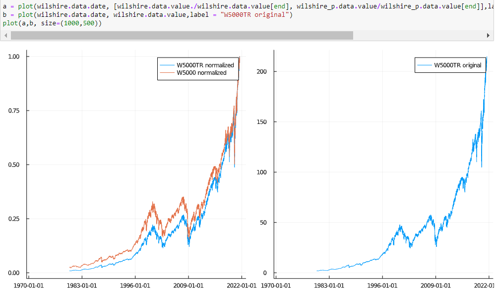
Both original datasets are not normalized to Q4 2007; Wilshire 5000 Total Market Full Cap Index WILL5000INDFC and GDP. However, Total Market Full Cap would imply a value far above 214. On a side remark, there are a bunch of Wilshire indices. It is simply done to make it comparable and once you have the same units, the ratio will always result in the same outcome (it does not matter if actual USD, or millions, or billions - as long as both are treated equally, you can also normalize them to 100 at some date - outcome is always the same).
In my opinion, the more commonly looked at is this one. The reason is that its base is the December 31, 1980 capitalization of USD 1,404.596 billion (so the value on that date is 1,404.569. Therefore, the index is an excellent approximation of dollar changes in the U.S. equity market. For instance, values of 2157.146 on December 30, 1985, and 2164.690 on December 31, 1985, represent an approximate increase of USD 7.5 billion. More details can be found on FT Wilshire 5000 Index Family.
The one used by FRED starts with a value of 1. Ignoring all details, this value is obviously not the market cap of 5000 companies. (Stock) Index construction is more difficult than most laymen expect (price indices even more so).
Dividing a value of ~100-200 by something that went from ~1.500 Billion to 20.000 billion over the same time is not particularly meaningful. Since you asked why FRED is not doing that, did you try that? I presume that would have answered your question.
The interpretation of the ratio is similar to the Price-Sales Ratio which is usually total market capitalization (the number of outstanding shares multiplied by the share price) divided by the company's total sales.
$$P/S \ Ratio = \frac{Market\ Cap}{Sales}$$If the value is below 1, the investor is paying less for each unit of sales (or more if above 1).
Think of the US as a giant corporation. Total Market Cap is Wilshire 5000 and GDP is by definition all final goods and services. However, neither of these two series refers to the actual monetary value in USD. So there is a need to make them comparable:
- turn them into actual USD
- normalize them
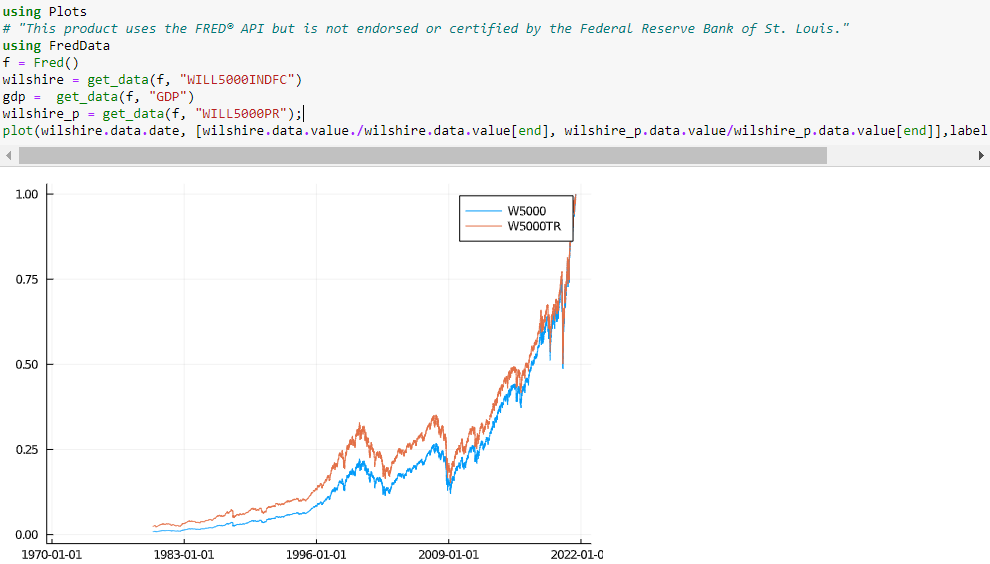
Whatever you chose, it will give you the same picture (albeit with different numbers). I could not find quickly what the actual value at the beginning of the Wilshire index used by FRED was (potentially a sign that my claim that the other one is more common is reliable). Since I already defined W5000 as being in billions, I know it is easily comparable to GDP. I simply use that as a lazy proxy. Charting both Wilshire indices (normalized to be 1 at the end) shows that they are very similar in magnitude indeed.

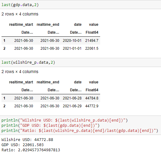
Now we have two series that are in billions.

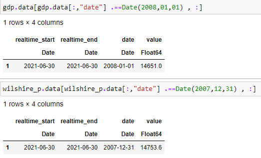
This looks (coincidence though) very similar to the last value that FRED displays. How come? Looking at the value of both series in Q4 2007 shows that the two series are almost identical at this time.

If you now divide the value in Q4 2007 by itself and multiply by 100, you get 100 for each series. Either way, the ratio in that period will be 1 (or close to). I suspect that may have been a reason for the choice of Q4 2007 as the base year but I do not have time to look up the reason at the moment. The entire history is therefore very similar. That depends on the choice of the base year, but overall it does not matter much (it is just the value that changes). All that matters is that you can compare it over time.
The next chart shows both Wilshire normalized as above, but now in comparison to the original value used in FRED's computation.

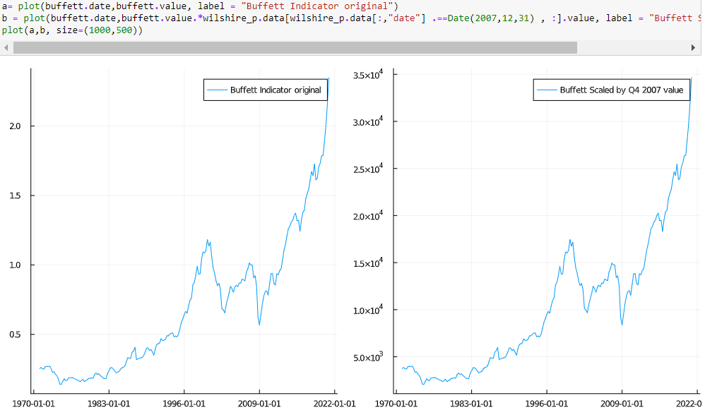
Last but not least, one can also "re-scale" with any value. Below is the Buffett Indicator (it seems to go back to an interview Warren Buffett gave to Fortune Magazine) in its original, and scaled by the value of the Wilshire index in Q4 2007.

The only difference is scale. I suppose the choice of FRED is the more natural one as it makes it more closely related to the Price-Sales Ratio interpretation.
Edit
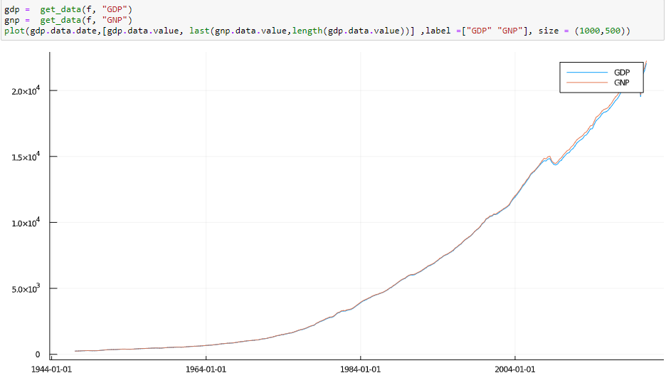
In terms of the "true" Buffett indicator, he actually used GNP and not GDP in his Fortune interview. It all really does not matter though. I have shown above that both Wilshire indices are almost identical. GNP and GDP is also very similar. Yes you can write, and some certainly have written, a PHD thesis on GDP vs GNP and computational differences, benefits and drawdowns and what not but it all does not matter here.

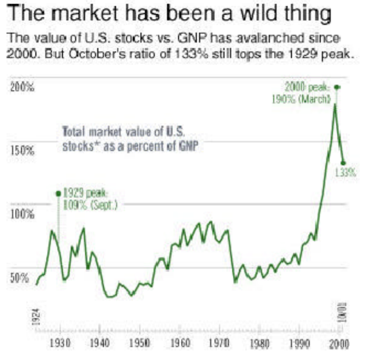
It is a kind of crude measure that is not saying much in isolation but gives you an idea of what on average happens. If that value is now 2 or 2.3 really does not matter at all. I cannot find an official link with a chart apart from some semi dodgy pdf sites but this is the original chart.

When you read the article, I think he never actually disclosed what he used. He simply states: "The chart shows the market value of all publicly traded securities as a percentage of the country's business--that is, as a percentage of GNP"
Between the two Wilshire alternatives discussed here, using the choice of FRED seems more reasonable for the task as this series also contains market capitalization that includes shares of stock not considered available to "ordinary" investors. However, it really (as shown above) makes no practical difference in terms of it usefulness as the "Buffett indicator".

