6
$\begingroup$

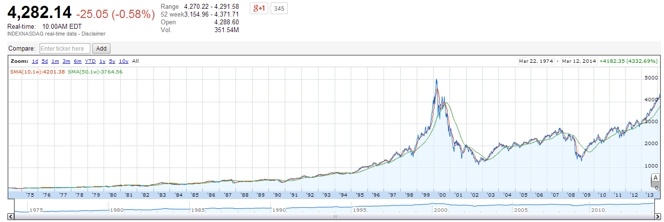
Today I have a search of historical NASDAQ back to 70s and noticed the index was slightly increasing in 70s-early 90s and rising up and down in recent decade of years. Why would that happen? The only reason I can think of is there isn't much computer trading involved so the market wasn't crazy like today? How do you think

NASDAQ Index (1975 - 2014)

$\endgroup$
2
  • $\begingroup$ Great question. But have you tried plotting with the y-axis from 0 to 500 only? This might tell a different story. $\endgroup$ Commented Mar 12, 2014 at 15:03
  • 1
    $\begingroup$ You need to log the chart. Your not going to see the price if it's either not inflation adjusted or logged. $\endgroup$
    – jessica
    Commented Mar 12, 2014 at 21:25

5 Answers 5

12
$\begingroup$

The volatility in the indices long ago was similar in magnitude to what it is today. The problem you are seeing in your plots is one of compounding and scaling.

Think of it this way- back in the mid 70's the magnitude of NASDAQ pricing was around \$100. Today it is on the order of \$4000, a change of 40x. In linear terms, a 1% change in the index today (\$40) would have been a 40% change in the index back in 1975. This goes the other way as well, so on a linear y-axis plot, a moderate swing in value in 1975 (say 1%, or \$1.00) is indistinguishable in 2014 terms.

There is a way to see the relative volatility over the years in a plot, and that is to use a logarithmic y-axis. I see you are using google's charting app. Under the chart there is a "settings" button. Click it, and select "logarithmic vertical axis." It makes a big difference.
$\endgroup$
1
$\begingroup$

Always use a semi-logarithmic scale when looking at prices. It makes percentage moves of equal heights on your graphs.

$\endgroup$
0
$\begingroup$

try to get a chart with prices for stocks that are not adjusted for dividends and splits, (from quandl, or yahoo) and you will see that the stocks were moving just like they do today, and even more since they didn't trade in decimals.

$\endgroup$
0
$\begingroup$

I plotted my own long term stock market price chart, nearly half a century ago, using semi-logarithmic scale and adjusting for inflation. So, I figure that now people are half a century late, in figuring out the obvious. But, at least people are starting to ask questions.

$\endgroup$
0
$\begingroup$

Here is the logic: Think of your investment as doubling and doubling again, and doubling again, rather than as going up a thousand, and then another thousand, and then another thousand. In other words, everything about investing is proportional, and that is EXACTLY what semi-logarithmic chart is.

$\endgroup$

Your Answer

By clicking “Post Your Answer”, you agree to our terms of service and acknowledge you have read our privacy policy.

Not the answer you're looking for? Browse other questions tagged or ask your own question.