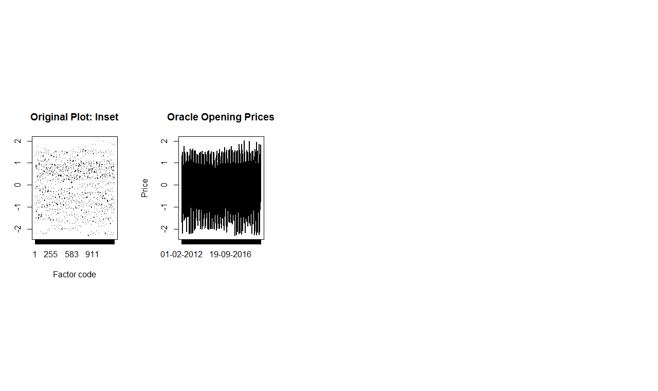
We have a dataset which has open,high,low and close values. We have normalized the data and trying to plot normalized open values against Date.
The dataset can be found at http://finance.yahoo.com/quote/ORCL/history?period1=1323475200&period2=1481328000&interval=1d&filter=history&frequency=1d
We tried to replicate the graphs from https://stats.stackexchange.com/questions/39279/how-to-plot-20-years-of-daily-data-in-time-series
The output is not as expected.
Code:
oracle$date <- as.Date(oracle$Date,"%y-%m-%d")
print(oracle$date)
Issue 1: It prints dates up to 2027 even when have values from 2011-2016.
oracle$week <-(as.integer(oracle$date) + 3) %/% 7
print (oracle$week)
oracle$week <- as.Date(oracle$week * 7 - 3, as.Date("2011-12-12", "%Y-%m-%d"))
print(oracle$week)
par(mfrow=c(1,2))
plot(as.factor(unclass(oracle$Date[1:1259])), oracle$NO[1:1259], type="l",
     main="Original Plot: Inset", xlab="Factor code")
plot(oracle$Date[1:1259], oracle$NO[1:1259], type="n", ylab="Price",
     main="Oracle Opening Prices")
Graphs are not displayed as shown in answer (8) of https://stats.stackexchange.com/questions/39279/how-to-plot-20-years-of-daily-data-in-time-series
tmp <- by(oracle[1:1259,], oracle$week[1:1259], function(x) lines(x$Date, x$NO, lwd=2))
print(tmp)
par(mfrow=c(1,1))
colors <- terrain.colors(52)
plot(oracle$Date, oracle$NO, type="n", main="Oracle Opening Prices")
tmp <- by(oracle, oracle$week,
function(x) lines(x$date, x$Open, col=colors[x$week %% 52 + 1]))
print(tmp)

