94
$\begingroup$

Finance is drowning in a deluge of data. Humans are not very good at comprehending large amounts of data. One way out may be visualization.

Traditional ways of visualizing patterns, complexities and contexts are of course charts and for derivatives e.g. payoff diagrams, a more modern approach are heat maps.

My question:
Do you know of any innovative (or experimental) ways of visualizing financial and/or derivatives data?

$\endgroup$
6
  • 1
    $\begingroup$ Do you accept to extend your question also to "audio visualization"? $\endgroup$
    – Beer4All
    Commented Dec 8, 2011 at 13:13
  • $\begingroup$ @Beer4All: What do you mean by extending it to that topic? What has audio to do with finance? $\endgroup$
    – vonjd
    Commented Dec 9, 2011 at 16:15
  • 3
    $\begingroup$ @vonjd -- Victor Neiderhoffer, developed a means of "playing" audio of market moves for his trading desk. I have a colleague, that creates audio files of fractal market structures. He can play an entire day's tick by tick volatility. It just provides a different way to experience the data. Such things, like the things this great question has evoked from the community, may can shift the way we think about things (notice a theme in my various comments across the sight?) and keep us fresh. $\endgroup$
    – Jagra
    Commented Jul 16, 2013 at 16:21
  • $\begingroup$ @Jagra: If you made an answer out of this comment I would definitely vote it up! Thank you for sharing. $\endgroup$
    – vonjd
    Commented Jul 16, 2013 at 16:39
  • 1
    $\begingroup$ live.bionictrader.io/bionic-trader <-- 3D live market viz. $\endgroup$
    – P i
    Commented Feb 14, 2020 at 8:36

14 Answers 14

63
$\begingroup$

Visualization should lead to truth and understanding. As such, I find that simple visualizations tend to be the best. My favorite visualization for showing relationships is the scatterplot. Once you start to even introduce a line plot, you are implying continuities between data that may not exist. And trying to introduce more advanced visualizations like network diagrams (ex) or complicated pie charts (ex) can lead to more confusion than understanding if misapplied.

A few thoughts:

  1. I think that you have already mentioned a few good ones. Heatmaps are good because they allow you to show three (or more) dimensional data without the added issues that arise when trying to create a 3D visualization. Payoff diagrams are simple but they accomplish their goal efficiently as a result.
  2. The FinViz website has a few nice examples of visualizations, including a simple bar chart, candlesticks, and heatmap.
  3. People often don't consider that it is possible to include more dimensions in a typical plot by changing the width, size, color, or intensity of a shape. This is a much better idea than trying to plot more than 2 dimensions spatially.
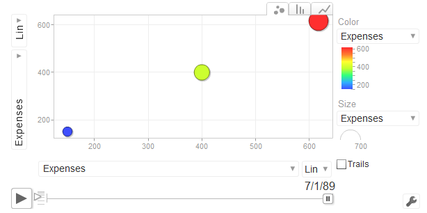
  4. The fourth real dimension is time, and time plays a very important role in financial data. One popular way to incorporate this as another dimension in a visualization is through video. A great example is gapminder, the software created by Hans Rosling, which made for some very compelling TED talks about global poverty. This was acquired by google and is now available as part of their web toolkit (also mentioned by Ben Hoffstein).

Visualization techniques from other fields are still very appropriate in finance, and the best starting point is Edward Tufte, especially "The Visual Display of Quantitative Information" and "Envisioning Information". You also can get a benefit from learning a visualization language. I recommend any of these three (in order of complexity):

These each have a learning curve, but once you learn how to use them they all allow for exploratory data analysis in a way that can't be achieved with other tools.

There are also many great and innovative commercial tools. To mention a few that are all used by banks and hedge funds:

  • Panopticon does an amazing job with real-time visualization.
  • Tableau, Spotfire, and Qlikview all allow for interactive visualization of data using in-memory databases.
$\endgroup$
7
  • $\begingroup$ Shane,great resources you list. Do you know the kind of technology that can be used to integrate these visualization into a webpage? $\endgroup$ Commented Feb 19, 2011 at 0:07
  • $\begingroup$ @Andy Which are you talking about specifically? Protovis is a javascript library, so that's straight forward. Processing is Java so that can be used from the web in any number of different ways. R doesn't have a specific web framework yet, but there are solutions (such as calling it from a foreign language interface). The commercial tools all have server versions. $\endgroup$
    – Shane
    Commented Feb 19, 2011 at 0:26
  • $\begingroup$ Shane, i was asking along those line. Which tools use which web technology and requiring which data format. For example, I'm personally interested in exposing data we have on XML, JSON format and create an interactive visualization of them and basically put anywhere on a website. $\endgroup$ Commented Feb 19, 2011 at 0:41
  • $\begingroup$ @Andy For interactive web visualization, I find either (a) you use one of the commercial tools (which I believe can all read XML/JSON data) or (b) expect to put in a fair amount of effort. Another option is the google visualization toolkit mentioned below. Using either Protovis or Processing can result in amazing stuff, but they are both very low level, so expect to get your hands dirty. ggplot isn't really intended for that kind of usage (IMO). One of the vendors might provide it to you for free with some advertising (try Tableau first: tableausoftware.com/products/digital). $\endgroup$
    – Shane
    Commented Feb 19, 2011 at 1:10
  • $\begingroup$ @shane, thanks. I have been dabbling in with Exhibit frame work (see simile-widgets.org) and currently use Datapress from the MIT team (we basically the biggest client of their tool). You can see it here (quantnet.com/program-selector). I always look for ways to present data in a more attractive way and at the same time provides easy way to manage for the owner. $\endgroup$ Commented Feb 19, 2011 at 5:34
25
$\begingroup$

The Google Motion Chart is a particularly elegant visualization for 'replaying' time series data. There is also an R package to interface with it.

enter image description here

$\endgroup$
22
$\begingroup$

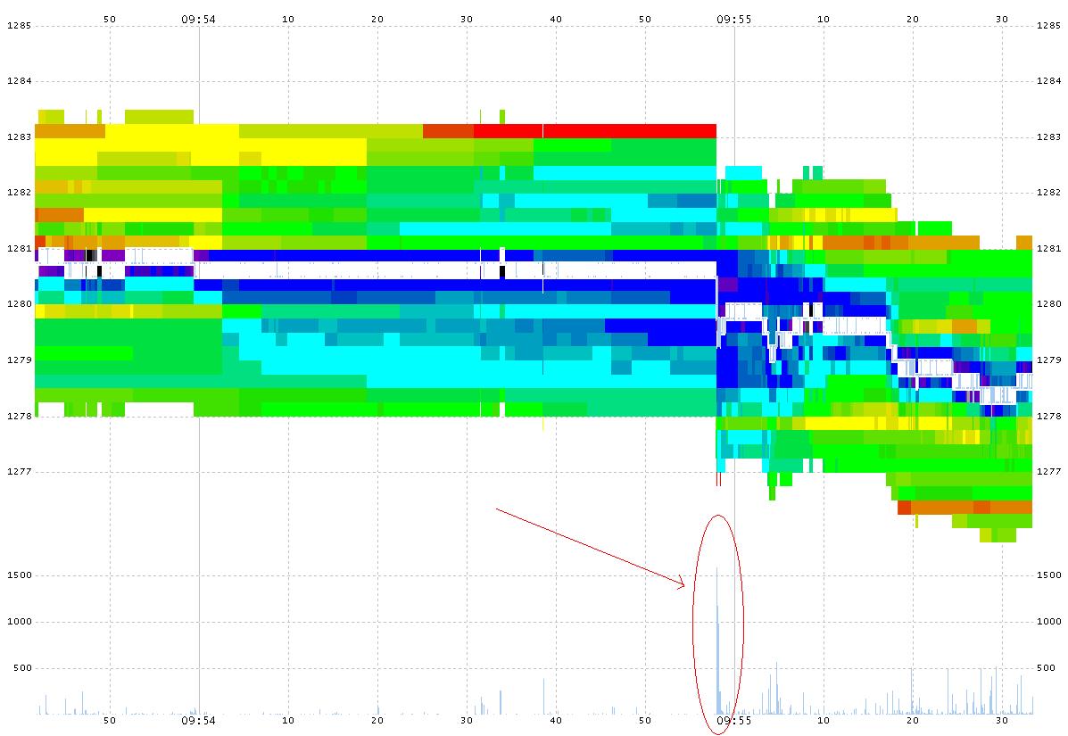
Nanex has an interesting way of showing the order-book:

The following images show CME's emMni future (S&P 500) depth of book and trades. The images are rainbow (ROYGBIV) color coded by the relative size at each depth level. Red indicates a lot of size, violet indicates size approaching 0. Note that a full minute before each event, the depth starts cooling rapidly. The volume of contracts traded is represented at the bottom of the chart.

Order book

More info here: http://www.nanex.net/Research/EMini1/Emini1.html

$\endgroup$
12
$\begingroup$

Shane's advice is good. I think it's worth adding the following two techniques not already mentioned:

Self-Organizing Maps (SOMs)

Seriation (pdf pertaining to R package seriation, but great intro to the topic).

They are not explicit visualize techniques, per se. Instead, they are algos that transform underlying data in ways that aim to lead to greater/new insight on the underlying data. Thus, in my mind, the above approaches share the common objective with xy plots, contour plots, scatter-plot matrices, heat maps, etc.

For strict quantitative visualization, Tufte, as mentioned above, a great place to start. Personally, I've gotten more out of Wong's, "The Wall Street Journal Guide to Information Graphics" and Janert's "Data Analysis with Open Source Tools". However, keep in mind that each have different audiences and objectives in mind.

I also believe Processing (mentioned by Shane) has a very bright future in finance - it's been used heavily by multimedia artists primarily because of its relative ease and great flexibility.

$\endgroup$
10
$\begingroup$

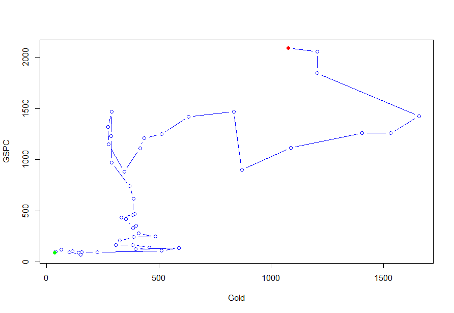
Although quite simple connected scatterplots can give interesting new insights on how time series perform together:

http://steveharoz.com/research/connected_scatterplot/

As an example: Gold vs. S&P 500 from 1970 till today: enter image description here

The green point marks 1970, the red point is today. Every point is a year, moving vertically upwards means rise in the S&P 500 without gold changing, moving horizontally to the right vice versa. The diagonal line would be perfect correlation.

On the given website are many example to play with and there is an accompanying paper which can be downloaded (pdf) free of charge.

$\endgroup$
8
$\begingroup$

And then music...

Victor Neiderhoffer, in a 2001 interview:

The market plays music all the time. The problem is you never know how the music of the market is going to end. But a good framework is that it will end on the tonic. Consonance to dissonance back to consonance. And whenever there's tremendous dissonance, strident moves in one direction, a good working hypothesis is that at the end, you'll find consonance again.

Mean reversion?

A 2007 New Yorker article on Neiderhoffer discussed some more of his music and markets ideas:

In “The Education of a Speculator,” he devotes an entire chapter to this notion, comparing the market’s movements to some of his favorite pieces of classical music, and juxtaposing pages of sheet music with stock charts. “When the markets are moving in my favor in a nice, gentle way—never below my initial price—I often think of the ‘Trout Quintet,’ ” he writes. “Another frequent work I hear in the market is Haydn’s Symphony No. 94. . . . Right after lunch, or before a holiday, the markets have a tendency to meander up and down in a five-point range above and below the opening. The pattern is similar to the twinkling C-major fifths of Haydn’s symphony.”

At some point, Neiderhoffer developed a means of "playing" audio of market moves for his trading desk. (I'll try to find a link to the source, its been a while since I saw it.


More interestingly...

I have a colleague, that creates audio files of fractal market structures. He can play an entire day's tick by tick volatility. It just provides a different way to experience the data. Such things, like the things this great question has evoked from the community, may shift the way we think about things and keep us fresh.

If anyone wants to listen to some short clips, contact me by my email, posted in my profile, and I'll send a few.

$\endgroup$
8
$\begingroup$

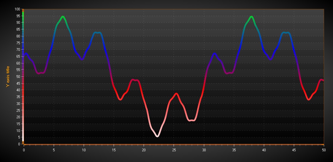
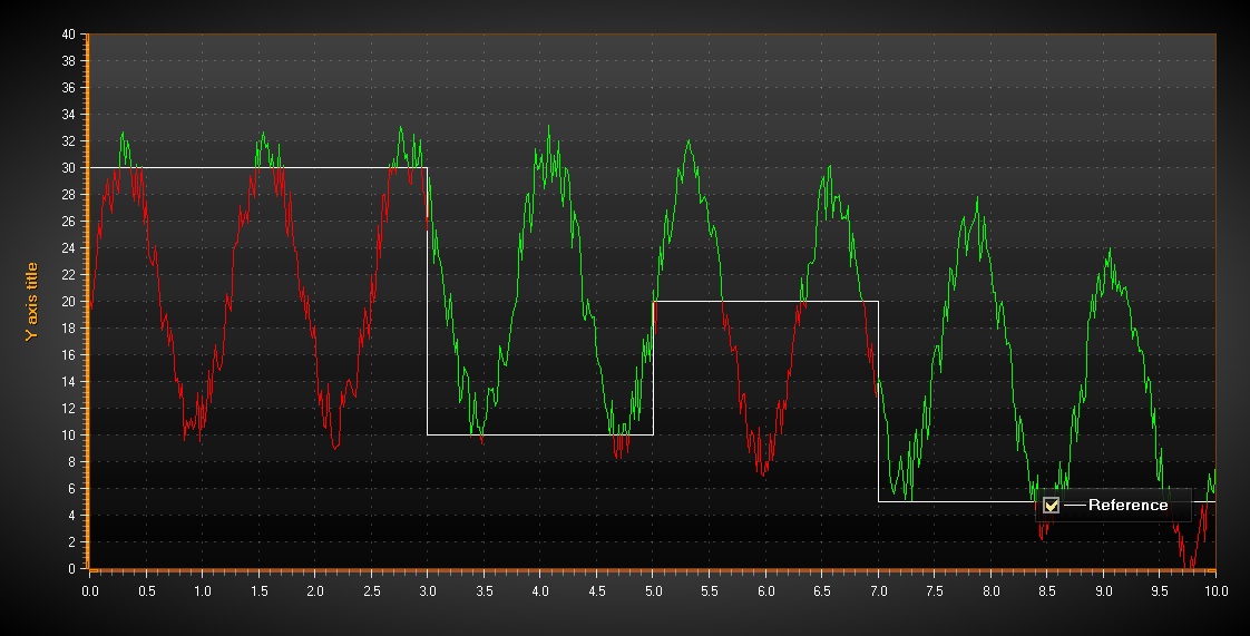
To me, coloring by data value is a great way to bring applications alive.

palette-coloring by data value

coloring by reference line

If traditional ways are not enough, probably taking 3D in use would be a way:

3D surface with coloring

3D gradient bars

And of course 2D heatmap is a very handy for sure.

I'm developing data visualization software components with 3D technologies, so definitely all feedback and ideas are welcome :-)

$\endgroup$
6
$\begingroup$

There are many price driven financial data finsualization concepts are available such as candle stick stock charts. However, there is an advanced charting concept, Mano Stick which is supply & demand driven charting concept. Mano Stick is a multidimentional charting concept which is able to display price information along with volume information to show trend changes in early statge.

Visit http://www.manostick.com/share-price-analysis.html. And see mano Stick at http://www.manostick.com/Images/MS-volume.png "manostick"

$\endgroup$
1
  • 5
    $\begingroup$ You should point-out that you are affiliated with the service you're mentioning. You know, potential conflict of interest and all. $\endgroup$ Commented Jun 26, 2011 at 4:40
2
$\begingroup$

Great question, I love to visualize data! A visualization is really the most efficient way to display a large amount of information to be processed by the human brain IMO. Depending on what exactly you are trying to plot and visualize, I would suggest trying the javascript API for WebGL called Three.js. Examples of Three.js are here: http://threejs.org/examples/

For example, I have created the following 3D Contour graphs with Three.js displaying a specific indicator (LPPL) for a time series here: https://lpplmarketwatch.com/3d-contour-examples/

I have brainstormed ways, unsuccessfully, to visualize the millions of traders interacting in a network - buying and selling, shorting, etc... It would be cool if anyone had any ideas on how to visualize a network with millions of nodes interacting in a trading exchange with Three.js -- perhaps with Bitcoin for a practical example, since I imagine most trade information is confidential or expensive.

$\endgroup$
4
  • $\begingroup$ +1: threejs is really impressive! I would encourage you to create a new question on your idea about visualizing interacting traders in a network. Perhaps somebody has already done something along those lines. $\endgroup$
    – vonjd
    Commented Mar 16, 2015 at 13:53
  • $\begingroup$ @Taylor, have you tried reactive programming? It reacts in real time , scales well (multicore, multi processor), it is responsive to software and harware failures and can be used on arbitrary data events/data lakes $\endgroup$
    – user7056
    Commented Apr 21, 2015 at 7:41
  • $\begingroup$ @user7056 No I have not tried. what did you have in mind? $\endgroup$ Commented Apr 25, 2015 at 20:00
  • $\begingroup$ @Taylor There are some détails here: class.coursera.org/reactive-002/lecture/3 $\endgroup$
    – user7056
    Commented Apr 26, 2015 at 22:15
1
$\begingroup$

download gnuplot better then matlab , R and has almost every thing you will need It can also do everything mentioned in the other posts, and even visualize data in real time, at no cost as its open source and offers output to almost any format you want even LaTex for your thesis.

$\endgroup$
3
  • 3
    $\begingroup$ Hello, and welcome to the site. You might notice that many of the answers here are pretty detailed. Your answer right now is a one-line opinion piece rather than a full response to the question. Consider this as a benchmark: What impression would this answer give your professor if he had asked this question in class? $\endgroup$ Commented Dec 8, 2011 at 6:16
  • 1
    $\begingroup$ I like it! Thanks for sharing, stonybrooknick! :) $\endgroup$
    – 楊祝昇
    Commented Dec 8, 2011 at 7:12
  • 1
    $\begingroup$ glad you like it $\endgroup$
    – pyCthon
    Commented Dec 13, 2011 at 2:01
1
$\begingroup$

BitListen -- "Realtime Bitcoin transaction and trade visualizer" is pretty neat.

$\endgroup$
1
$\begingroup$

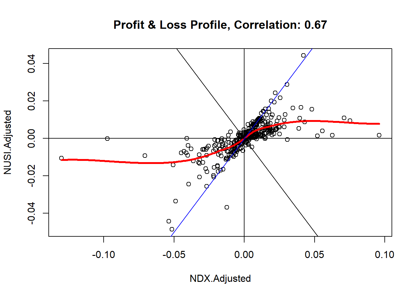
LOESS diagrams show the payoff structure of any investment vehicle in relation to a benchmark (i.e. "underlying"). Even complicated trading strategies of (hedge) funds or ETFs become accessible this way:

enter image description here

I published a blog post with some background information, fully documented R-code and many examples: Financial X-Rays: Dissect any Price Series with a simple Payoff Diagram

$\endgroup$
0
$\begingroup$

Chernoff faces are also a good and undervalued idea http://en.wikipedia.org/wiki/Chernoff_face. It is applicable to multivariate statistical data, which, I beleive, occur frequently in world of finance/

$\endgroup$

Your Answer

By clicking “Post Your Answer”, you agree to our terms of service and acknowledge you have read our privacy policy.

Not the answer you're looking for? Browse other questions tagged or ask your own question.