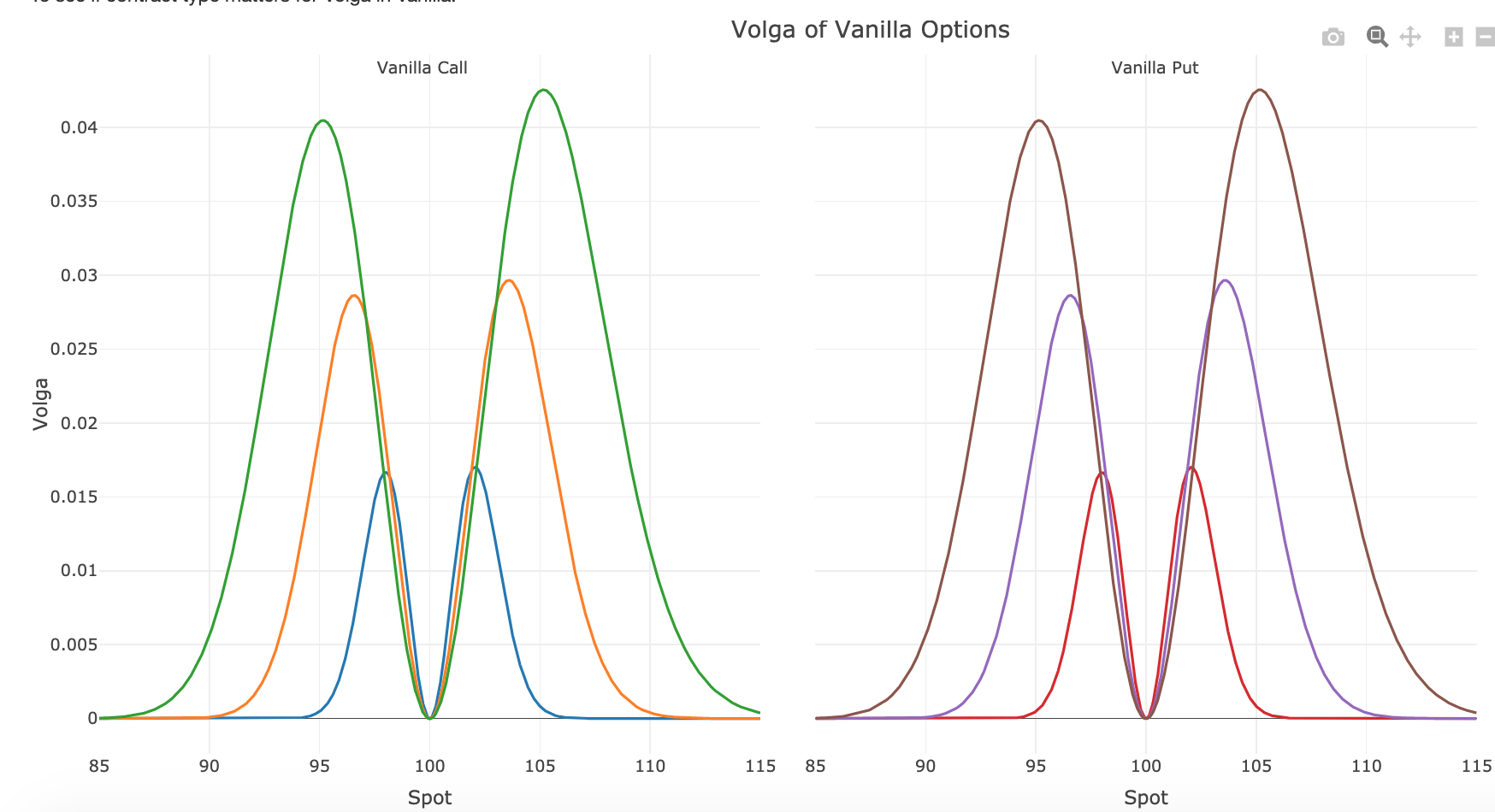
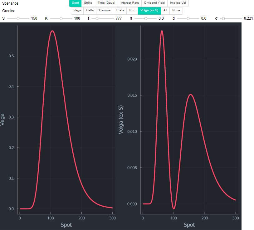
I've plotted the charts of Volga of Vanilla Call/Put using finite difference method, and found they are the same, and an asymmetrical shape of observed for both. Any intuitive way to explain the behaviour, or why ITM call/OTM put has higher Volga?
-
1$\begingroup$ These charts look correct. ericbenhamou.net/documents/Encyclo/volga.pdf The Vega of a Put and a Call are the same (due to put call parity), so the volga (the derivative of vega with respect to $\sigma$) of Put and Call are also the same. Also, it is true that it goes to zero when $S=K$. But your main question, about the asymmetric peaks, I don't know the answer. $\endgroup$– Alex CCommented Aug 29, 2019 at 0:06
1 Answer
The shape you observe is really only due to spot being higher for ITM calls & OTM puts.
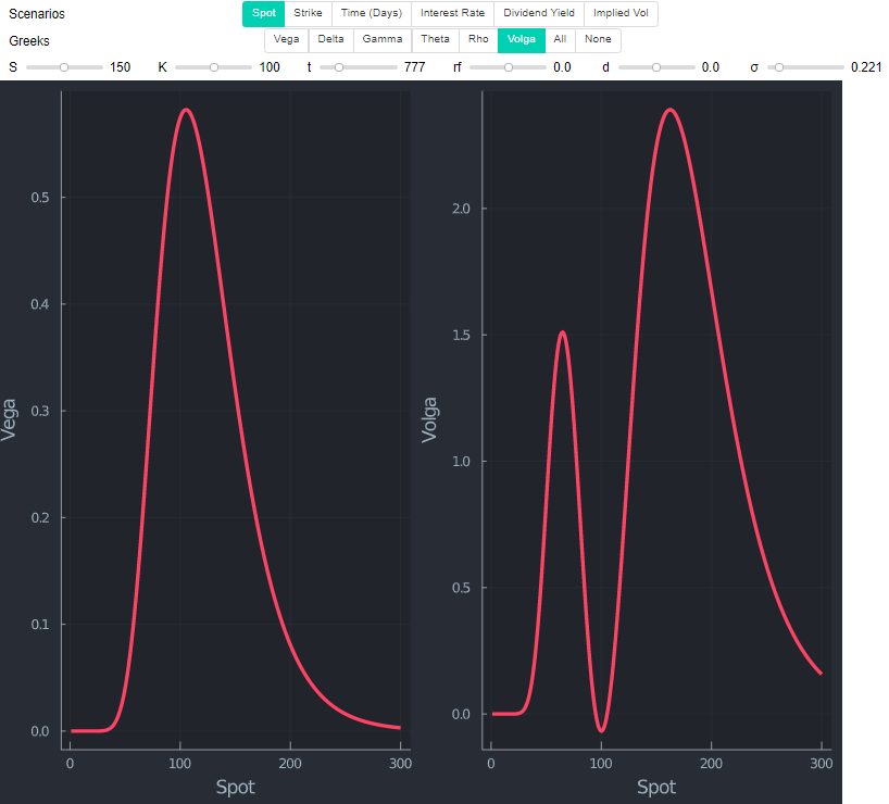
The plots are definitely correct. You can quickly check by using standard closed form volga, which is $$vega*\frac{d1*d2}{\sigma}$$.
Changing risk free rate and dividends just shifts the whole graph slightly left or right respectively.
Volga is $$vega*\frac{d1*d2}{\sigma}$$ hence $$ S * e^{-d*t}*n(d1) * \sqrt \tau*\frac{d1*d2}{\sigma}$$ with $d_1= \frac{\ln S- \ln K +(r-d+\frac{1}{2}\sigma^2)\tau }{\sigma \sqrt{\tau}}$ and $d_2= d_1 - \sigma \sqrt{\tau}$.
As $n(d1)>0$ whenever $\sigma \sqrt{\tau}>0$, it can only be explained with two things, spot $S>0$, or the term $\frac{d1*d2}{\sigma}$. The latter is a bit tricky, and could be similar to what happens with delta at a first glance. The $d1*d2$ part may look daunting, but PCs allow you to deal with this quickly. The below uses Julia.
function d1d2Vol(S,K,t,rf,d,σ) d1 = ( log(S/K) + (rf - d + 1/2*σ^2)*t ) / (σ*sqrt(t))
  d2 = d1 - σ*sqrt(t)
  vega_c = S * exp(-d*t)*n(d1) * sqrt(t)*0.01
  volga = vega_c*((d1*d2)/σ)
  return d1*d2/σ, vega_c, volga
end

spotRange = 10:10:300
K         = 150
rf        = 0
d         = 0
σ         = 0.2
t         =1
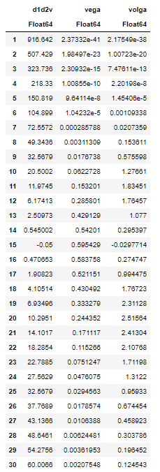
df = DataFrame(d1d2Vol.(spotRange,K,t,rf,d,σ))
rename!(df,[:d1d2v,:vega,:volga] )
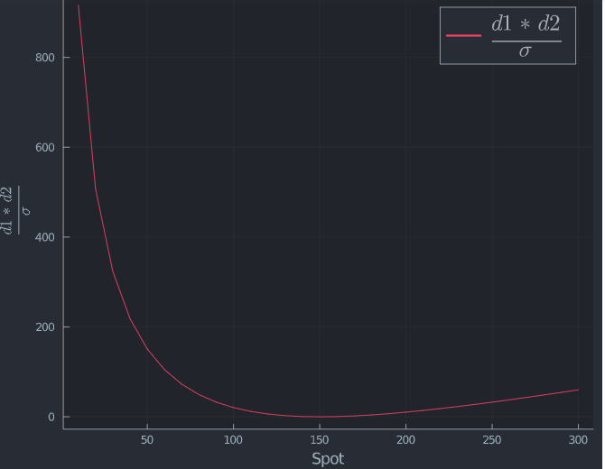
This looks like $(d1*d2)/σ$ actually has the opposite effect of what is observed. Plotting it shows this indeed.
plot(spotRange,[df.d1d2v], label= L"\frac{d1*d2}{\sigma}",size=(800,650), legendfontsize=20, xlabel = "Spot", ylabel= L"\frac{d1*d2}{\sigma}")
So the only thing left to explain the difference (that also must offset the opposite effect of $(d1*d2)/σ$) is the spot price. If you take a closer look at Black Scholes, this also makes intuitive sense. The standard formula as shown here is providing a result in currency.
function BSM(S,K,t,rf,d,σ)
  d1 = ( log(S/K) + (rf - d + 1/2*σ^2)*t ) / (σ*sqrt(t))
  d2 = d1 - σ*sqrt(t)
  c  = exp(-d*t)S*N(d1) - exp(-rf*t)*K*N(d2)
  vega = S * exp(-d*t)*n(d1) * sqrt(t)*0.01
  volga = vega*((d1*d2)/σ)
  return c, vega, volga
end
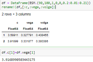
Now, pricing two identical options with $S=90$, $K=100$, $t=1$ year, zero rates and dividends and the only difference being vol of $\sigma=0.2$ and $\sigma=0.21$ you can see how adding vega is close to the new value of the option after increasing vol.
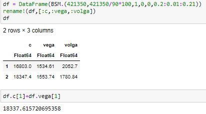
However, that is dependent on the actual value of spot (and strike). Assume you look at Berkshire which is currently around USD 421,350.
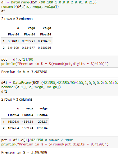
Vega still works, but the value is vastly different to before. "Issue" here is that the BS price is in cash, not percent of underlying. If you transform it into a comparable percentage price, you see that both options ae priced the same way (which they should as it is the same inputs and same moneyness).
You can easily transform one volga into the other by dividing by spot of the volga, and multiple by other spot value.
A final sanity check is to exclude S in the volga formula and plot the same value again. Indeed, as the size of $(d1*d2)/σ$ suggests, the highest point is now actually on the left hand side.

